The Vision
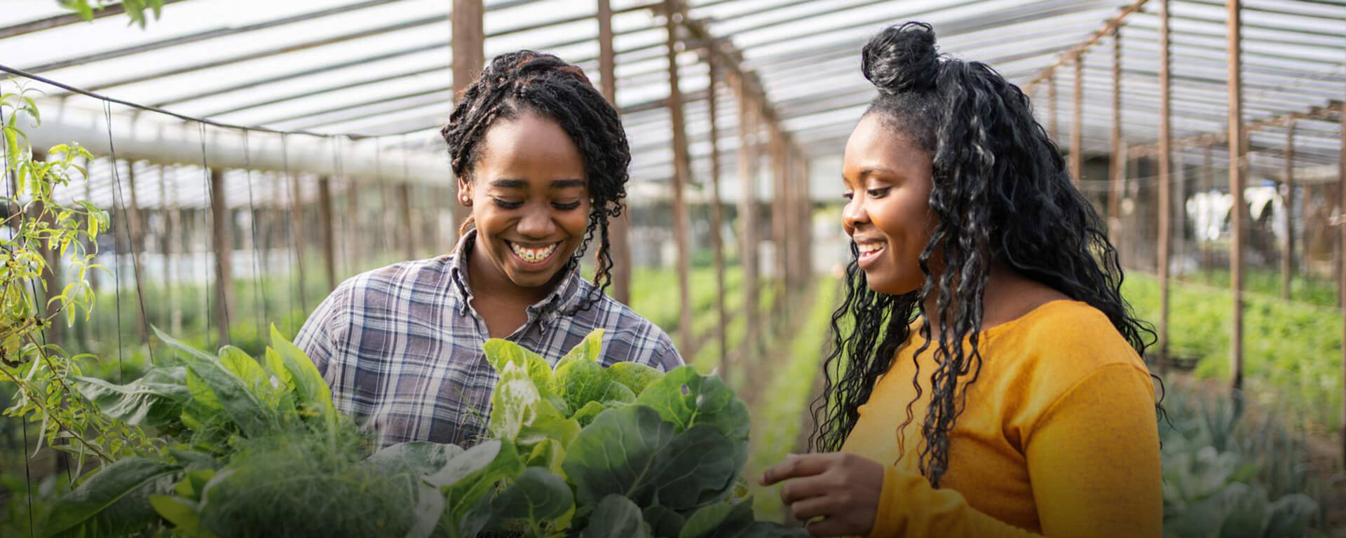
By pooling resources and knowledge from funders, farmers, advocates, food suppliers, purchasers and community partners from Native and non-Native communities across the country it’s possible to transform our food systems through creating equitable good food procurement.
The Challenge
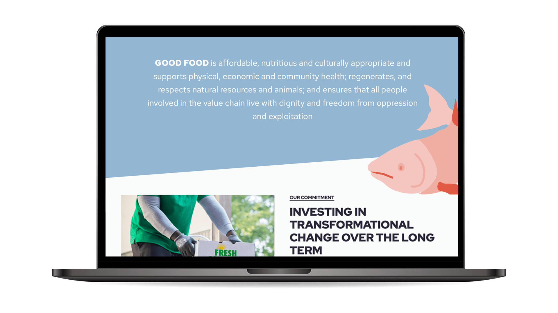
As a new and still growing pooled fund co-designed with many stakeholders, it was critical to launch with a new name, visual identity, website, and PR strategy which spoke to both potential funders and to applicants of the fund itself. We saw early on that it was important that funders could understand the seriousness and commitment to the work through the visual design language. Likewise, the farming audience was keen to pick up on conveying authenticity and a feeling of being represented within the brand itself.
Our Approach
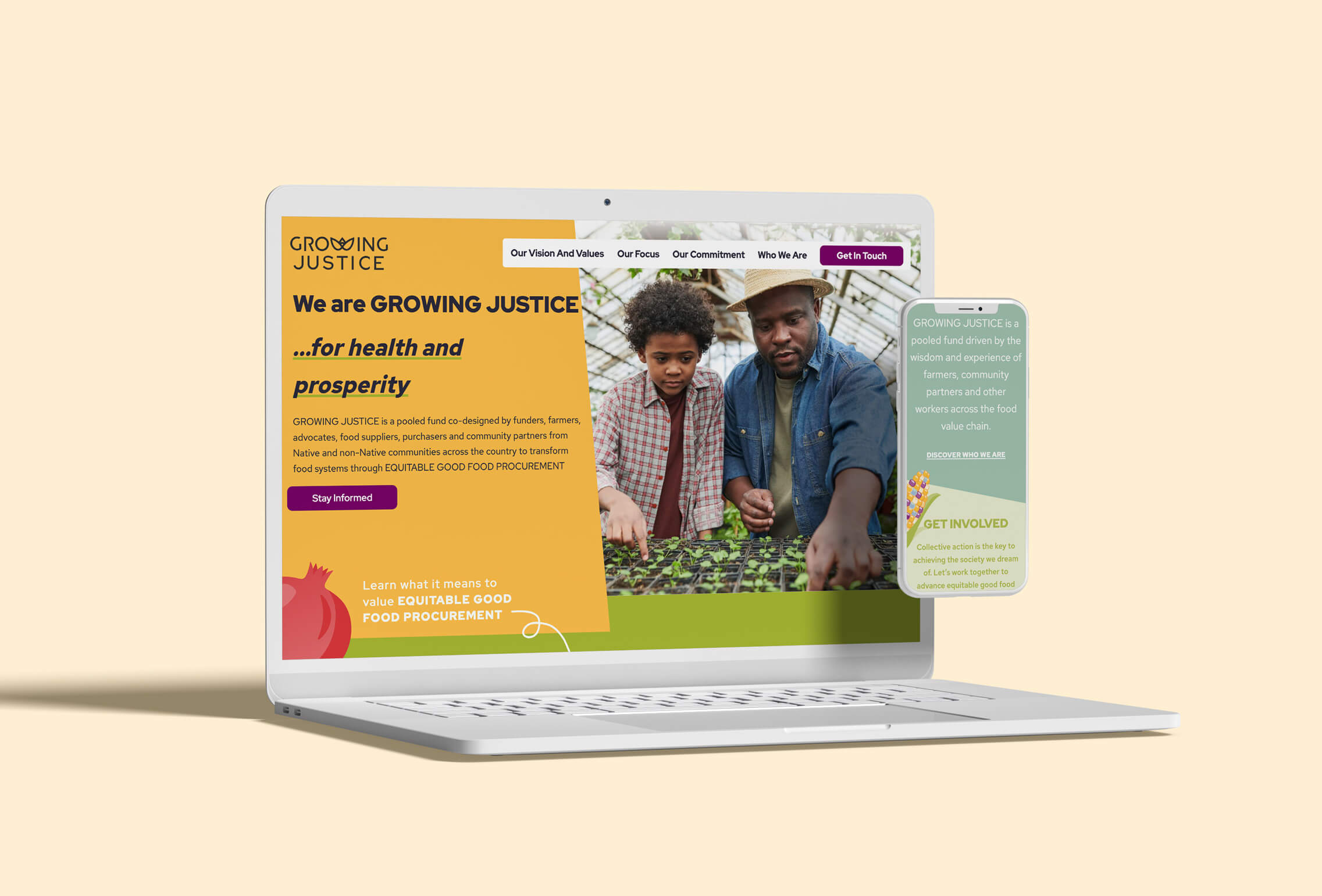
We worked together with the input and feedback of both funders and farmers to create a visual language, logo, landing page, as well as a name which could contain broad appeal to the very different audience groups.
Results so far
In the fall of 2022 Growing Justice, The Fund for Equitable Good Food Procurement, launched with its new name, logo, visual language, and website.
The Fund launched with pledges of $11 million and an aim to invest at least $50 million over the next 10 years. The success of the naming, web design, and visual identity for the brand lead to continued partnership with the client, MESU Strategies, including crafting PR strategy for the launch as well as creating social media assets for future campaigns.
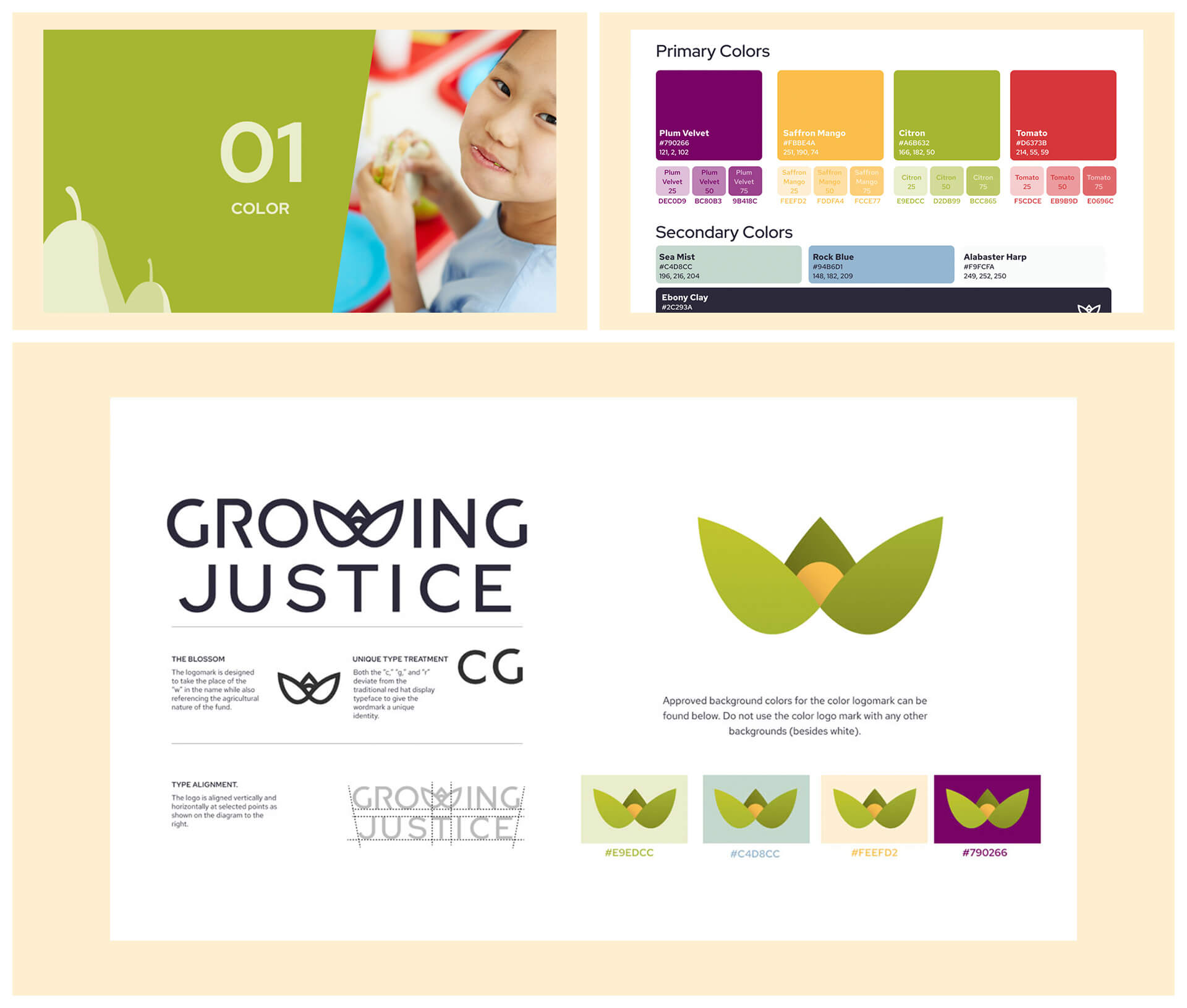
The visual brand guide we created for Growing Justice included a custom created logo and logo mark for the brand as well as color, photography, and typography guidelines.
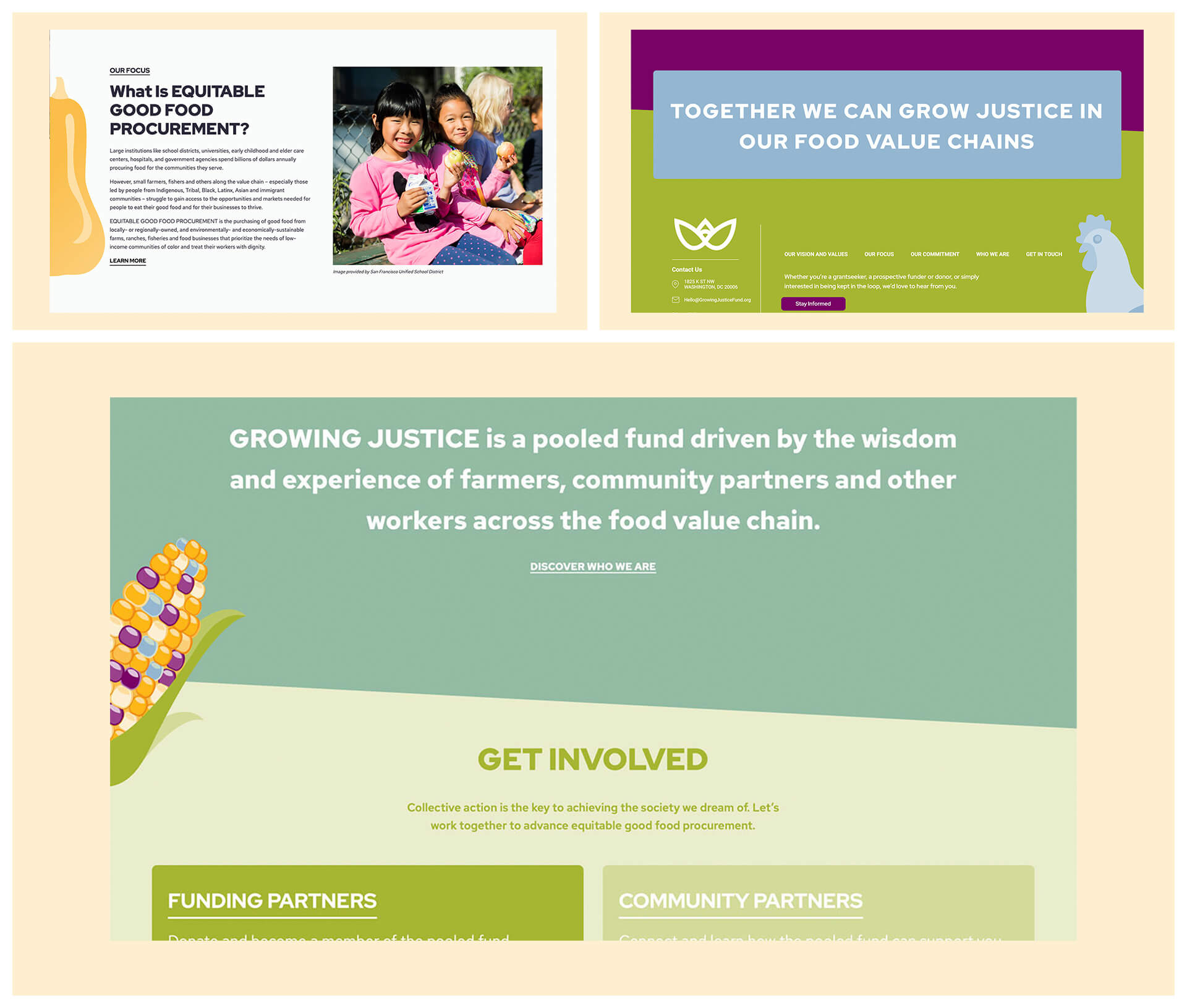
For this brand, we created a number of food related custom illustrations which were integrated into the web design as well as presentation and social media graphic templates.
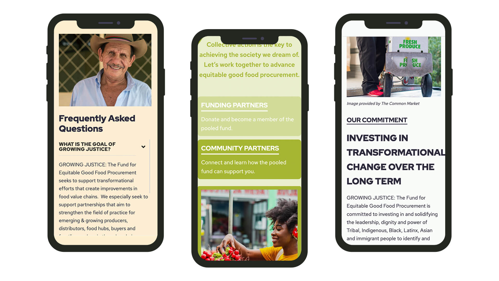
Many of the fund’s applicants live in rural settings with unstable home internet connections, for this reason we designed the website to be mobile friendly from the start.
